Mobile gaming isn’t “small gaming” anymore. It’s where the real product fights happen: speed, comfort, community, and that slippery thing called vibe. A game can be brilliant and still get deleted in 30 seconds if it feels annoying on a phone.
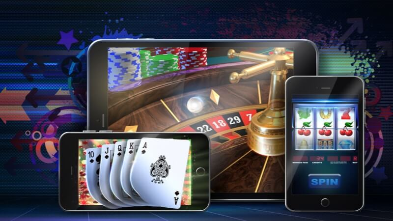
That’s also why casino-style mobile experiences keep pushing into app-first territory. The tamasha live casino app is a good example of where the market’s headed: quick access, live energy, and a layout built for thumbs, not desktops squeezed into a smaller screen.
Thumb-first design is winning
The biggest UX trend is almost embarrassingly simple: one-hand play. People use phones while walking, holding coffee, half-watching TV. Two-handed “precision tapping” is a niche.
So designers are leaning into:
- bottom-heavy controls that sit where the thumb naturally rests
- big hit targets and fewer tiny icons
- swipe actions instead of multi-step menus
- clean screens that don’t feel like a cockpit
Even hardcore genres are adapting. If an action requires three taps and a confirmation pop-up, it’s already behind.
Fast start or no start
Mobile users don’t “settle in.” They drop in. That changes everything.
Games are being rebuilt around speed:
- lighter installs (or instant play options)
- smarter loading that doesn’t stall on splash screens
- fewer forced tutorials and more “learn as you go”
- sessions that feel real even if they last two minutes
It’s not just convenience. Speed is trust. A slow, jittery first impression feels sketchy, even when it isn’t.
Live ops turned games into living services
A lot of mobile games aren’t finished products. They’re ongoing shows.
The trend is live operations that keep things moving:
- limited-time modes and timed events
- rotating content drops
- seasonal progression systems that reset the motivation loop
- in-game “moments” designed to pull players back at specific times
Some people hate it. Fair. But from a UX perspective, it changes the relationship: the app stops being a game and starts being a place where things happen.
Interfaces are getting smarter about clutter
Mobile screens are not forgiving. Yet some games still try to stack five currencies, three banners, two chats, and a “special offer” that screams at the top. Exhausting.
A noticeable trend is calmer UI:
- collapsible panels instead of permanent noise
- contextual controls that appear only when needed
- cleaner typography and higher contrast (so it’s readable outdoors)
- fewer interruptions mid-action
It’s not minimalism for Instagram. It’s survival. If the screen feels busy, the brain checks out.
Haptics and micro-feedback: tiny signals, big difference
Mobile is physical. That’s the advantage consoles don’t have in the same way.
Good apps now use:
- subtle vibration cues for confirmations (not the cheap “buzz for everything”)
- sound design that signals timing, success, or risk
- small visual pulses that make taps feel responsive
These details make the experience feel tighter, more “real,” even if the game itself is simple. Bad feedback makes everything feel laggy, even when it’s not.
Performance scaling is becoming a core feature
Not everyone plays on a flagship phone with perfect Wi-Fi. Mobile gaming has to work on a messy range of devices and networks, and players don’t care why it’s struggling.
So developers are putting more effort into:
- adaptive graphics settings that aren’t buried
- stable frame pacing over flashy effects
- battery-saving modes that don’t wreck gameplay
- better handling of network drops (reconnects that don’t punish the user)
Smooth beats pretty. Every time.
Social is shifting from “add friends” to “instant belonging”
Social features used to be formal: friend requests, long lists, awkward invites. Mobile users often skip that.
Now it’s lighter and faster:
- quick team-ups, temporary squads, drop-in rooms
- spectator modes and shared challenges
- chat that’s optional but present (and moderated enough to be usable)
- community events that feel like everyone’s in on the same thing
It’s not just about talking. It’s about feeling like the app isn’t dead.
Identity and continuity matter more than ever
People switch devices. They switch networks. They switch moods. The best mobile experiences don’t punish that.
Expect more emphasis on:
- easy account recovery that doesn’t turn into a support ticket nightmare
- cross-device sync that actually keeps progress intact
- consistent UI patterns across game modes (no “new screen, new rules” whiplash)
A smooth login and return flow is part of gameplay now, whether anyone calls it that or not.
Payments and monetization are getting… more subtle
The loud era of “BUY NOW!!!” pop-ups is still around, but the smarter trend is quieter monetization that doesn’t wreck the session.
What’s showing up more:
- optional boosts that feel like convenience, not coercion
- bundles framed as time-savers
- fewer checkout steps
- clearer pricing displays (especially important in regulated categories)
Players may complain about monetization, but they react even harder to bad purchasing UX. Confusing checkout flows kill trust instantly.
Responsible design is becoming a selling point
Mobile gaming is finally being forced to grow up a bit. Not just because of regulation, but because users are more aware of habit loops and screen-time burnout.
More apps are adding:
- session reminders
- spending controls where relevant
- easier-to-find settings for notifications and limits
- clearer, less sneaky prompts
This isn’t about being “nice.” It’s about retention. People don’t stick with apps that make them feel out of control.
Where this is heading
Mobile gaming UX is moving toward a clear formula: faster entry, fewer hassles, more live energy, and interfaces designed for the way phones are actually used (imperfectly, one-handed, half-distracted).
The winners won’t necessarily be the most complex games. They’ll be the ones that feel good to use. Quick to open. Easy to understand. Hard to mis-tap. And responsive enough that the phone stops feeling like a barrier and starts feeling like the controller it always wanted to be.